Data Discovery: Chart Building Examples
👤 This documentation is intended for Discovery Users.
Data Discovery enables Discovery Users to create visualizations on datasets through a drag-and-drop interface that does not require SQL.
Note: The details below depict our latest Data Discovery update, to be released on April 1st, 2019.
Note: Data Discovery is available on select plans. Site administrators can contact their Customer Success Manager for additional information.
For how to create a dataset for use in discover mode, see our documentation here
For information on the data discovery interface, see our documentation here
For FAQ on data discovery, see our documentation here
Example 1: Monthly New Users, Segmented by Platform, from Users Sourced Organically (Area Chart)
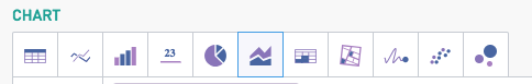
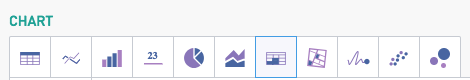
Step 0: Determine the Chart Type
While many chart types can be used to display this information, this example will leverage the Area chart option
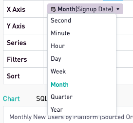
Step 1: Determine the X Axis
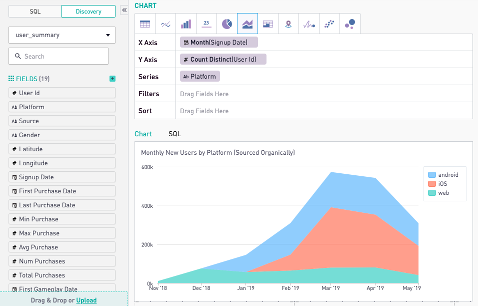
To put the month on the x axis, drag the date field (in this case signup_date) into the X Axis field. The drop down menu arrow that appears by the name of the field allows different aggregation options. Here, select "Month."
Step 2: Determine the Y Axis
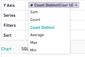
The Y axis must show the total number of new users created. This can be calculated by finding the sum of the "User Id" field in our dataset. Drag this field into the Y Axis field. Since this field is numeric, the dropdown menu will show various calculations that can be performed on the price object. Click on “Count Distinct.”
So far, the final chart shows total monthly new users..

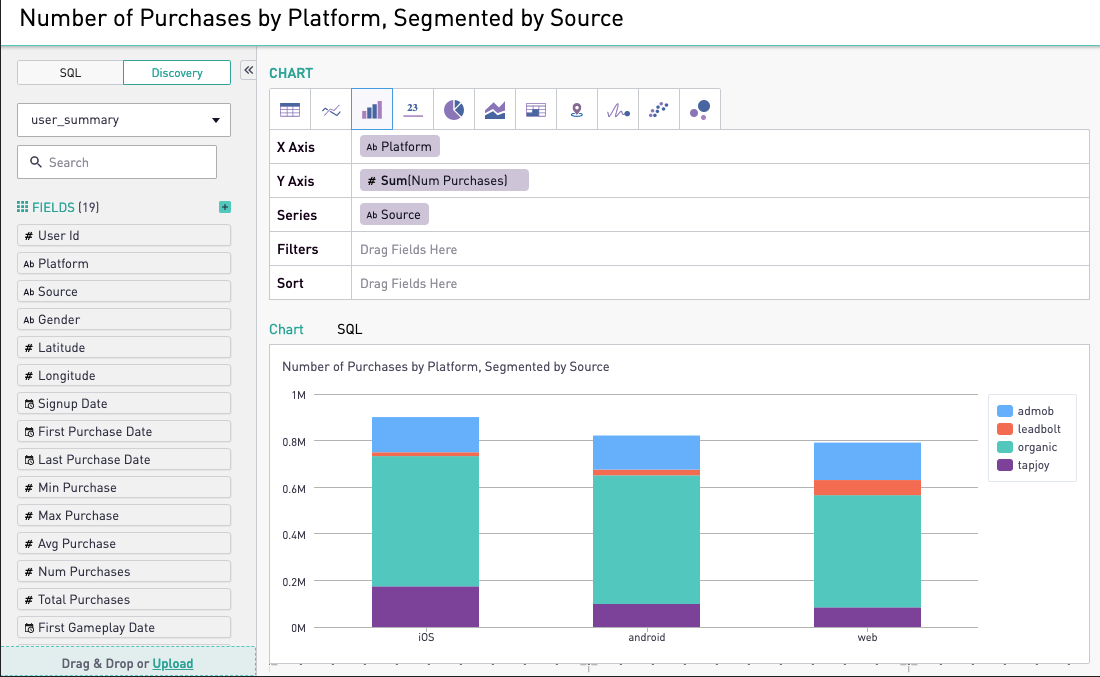
Step 3: Determining a Series
To cut, slice, or segment data, drag the appropriate field into the "Series" field. In this case, our chart will show monthly new users by platform
Step 4: Assigning Filters
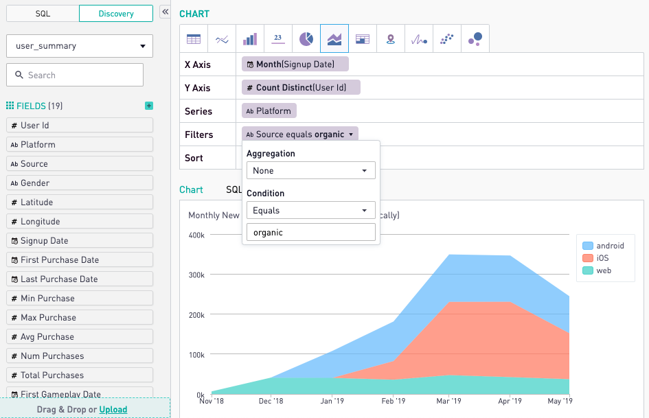
To filter the result set on a specific subset of the data, drag the field that determines the filtering criteria into the Filters field. The drop down menu allows users to define their exact criteria. Here, the "Source" field must be set equal to organic and the chart updates accordingly.
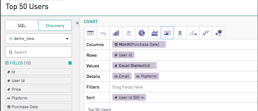
Example 2: Monthly Number of Purchases among Top Users (Cohort Grid)
Step 0: Determine the Chart Type
Select the Cohort grid chart type. Cohort grids provide similar functionalities as tables with additional parameters, such as Rows, Values, and Details.
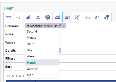
Step 1: Determine the Columns
Since the cohort grid will show the monthly number of purchases, each column should represent one month of data. Drag the Purchase Date into the Columns field, and select Month as the date aggregator type.
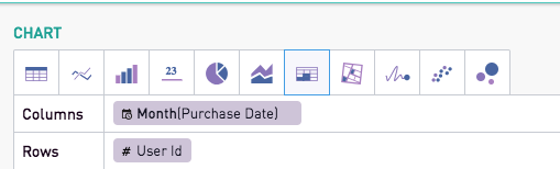
Step 2: Determine the Rows
The rows will correspond to the userid for each of the users on the platform.
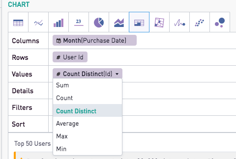
Step 3: Assign Values
The goal of this cohort grid is to show the number of purchases. Each purchase is identified by a unique ID. Calculating the count of distinct IDs will provide the number of purchases per user.
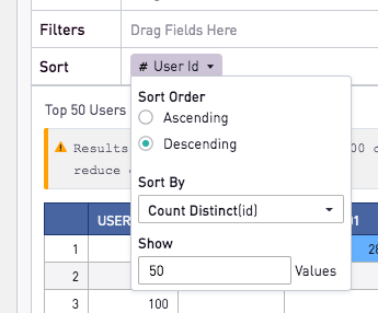
Step 4: Limit the Result Set to Top 50 Users only
The goal of this analysis is to only provide metrics for the top 50 users. To achieve this, drag the same field used in the "Row" field to the "Sort" field. Here, a drop down box will appear with further options on the sorting criteria. In this case, the sort order must be "Descending" (highest values will be shown at the top of the chart). The "Sort By" field is Count Distinct(id), corresponding to the number of unique purchases per user. The value in the "Show" field determines the number of rows the final analysis will display. In this case, the cohort grid will show only the top 50 users.
Step 5 (Optional): Add Detail Columns
Detail columns provide additional context to the analysis. User IDs, while great for building analyses, are not efficient for reporting. Adding a detail field with the user's email address solves for this. Additionally, the analysis users could be further classified by platform; simply add Platform as a second detail column. The final result displays the top 50 users on the platform, with additional information on their email addresses and platform.