Graph-like Charts - Special Settings
👤 This documentation is intended for SQL Users and Discovery Users
Graph-like charts is the family of charts that require using at least two columns to plot in relation to each other.
In addition to generalized chart settings, individual graph-like charts have special settings based on their type.
<div><UL>
<LI><a href="#LineCharts">Line Charts</a></LI>
<UL>
<LI><a href="#ShowRollingAverage">Show Rolling Average</a></LI>
</UL>
<LI><a href="#SparklineCharts">Sparkline Charts</a></LI>
<UL>
<LI><a href="#SLShowCumulative">Show Cumulative</a></LI>
</UL>
<LI><a href="#NumberOverlay">Number Overlays</a></LI>
<UL>
<LI><a href="#RoundingNumbers">Rounding Numbers</a></LI>
<LI><a href="#NOShowCumulative">Show Cumulative</a></LI>
<LI><a href="#OriginalValue">Show Original Value on Hover</a></LI>
<LI><a href="#TextSize">Text Size</a></LI>
<LI><a href="#DisplayingText">Displaying Text</a></LI>
<LI><a href="#ConditionalFormatting">Conditional Formatting</a></LI>
</UL>
<LI><a href="#AreaCharts">Area Charts</a></LI>
<UL>
<LI><a href="#ProportionalArea">Proportional Area</a></LI>
</UL>
<LI><a href="#ScatterCharts">Scatter Charts</a></LI>
<UL>
<LI><a href="#ShowTrendline">Show Trendline</a></LI>
</UL>
<LI><a href="#BarCharts">Bar Charts</a></LI>
<UL>
<LI><a href="#ProportionalBars">Proportional Bars</a></LI>
<LI><a href="#GroupedBars">Grouped Bars</a></LI>
<LI><a href="#HorizontalBars">Horizontal Bars</a></LI>
</UL>
<LI><a href="#BubbleCharts">Bubble Charts</a></LI>
</UL></div>
<HR>
<a name="LineCharts"></a>
Line Charts
Line charts will connect the generated points with lines. Multiple line segments can be plotted by adding a third column that groups the points into separate subsets.
Note: If there are multiple points in a series with the same x-axis value, the sum of all of the y-values on that point will be plotted.
<a name="ShowRollingAverage"></a>
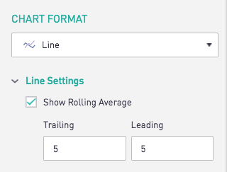
Show Rolling Average
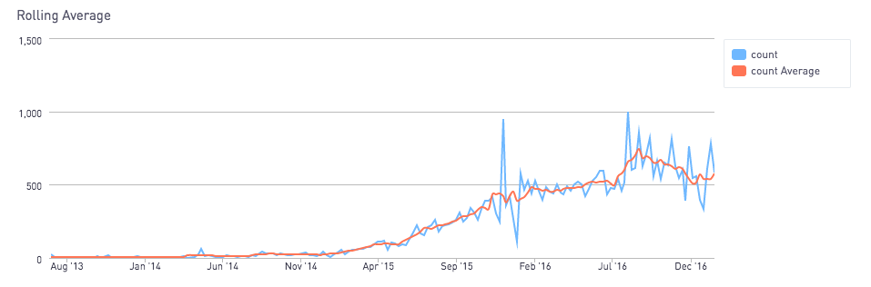
Line charts have an option in the Chart Format tab called "Show Rolling Average". For each line segment on the chart, this adds a new line segment that computes the average value for a point based on its values over the specified window. The default window is the five previous and five following points. It will look something like this:
The resulting chart has added a segment that computes the average value at each point based on its trailing and following five values.
<a href="#top">Back to top</a>
<a name="SparklineCharts"></a>
Sparkline Charts
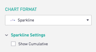
Sparkline charts plot the line without including the axes. They also display the value of the most recent data point. They can be a great tool for creative display purposes.
<a name="SLShowCumulative"></a>
Show Cumulative
The "Show Cumulative" option in the Chart Format tab displays the cumulative value of all the points on the first line segment rather than the most recent point.
<a href="#top">Back to top</a>
<a name="NumberOverlay"></a>
Number Overlays
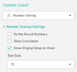
Number overlay charts display a value either by itself or over an underlying chart. These are a great choice for clearly displaying information and values on a dashboard. By default, the value of the most recent point gets shown.
<a name="RoundingNumbers"></a>
Rounding Numbers
Number overlay charts automatically round the value that gets displayed. This can be overridden to display the value as it appears in the table form by enabling the "Do Not Round Numbers" checkbox in the Chart Format tab. Numbers formatted as currencies with this option checked will still be rounded to two decimal places.
<a name="NOShowCumulative"></a>
Show Cumulative
The "Show Cumulative" option in the Chart Format tab displays the cumulative value of all the points on the first line rather than the most recent point.
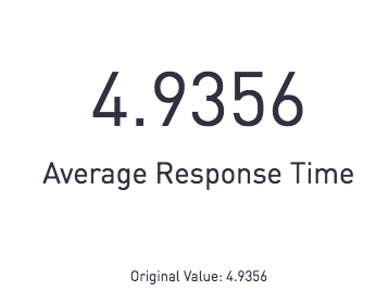
<a name="OriginalValue"></a>
Show Original Value on Hover
Number overlay charts that only return one value instead of multiple columns for both x and y axis values will not show a graph in the background and will automatically display the original value when hovering over the chart. To override this, deselect "Show Original Value on Hover"
<a name="TextSize"></a>
Text Size
The text size of the number overlay can be adjusted under the "Text Size" drop down menu under the Chart Format tab. Select "Autofit" for the text size to be automatically adjusted based on the size of the number overlay chart box.
<a name="DisplayingText"></a>
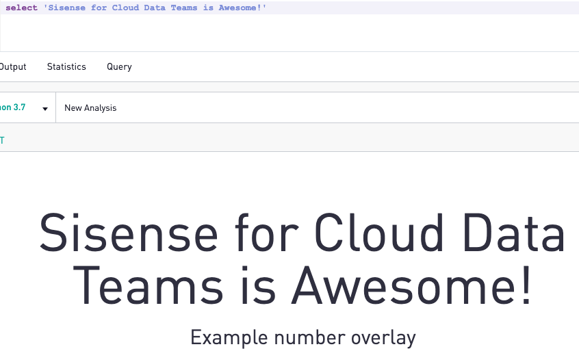
Displaying Text
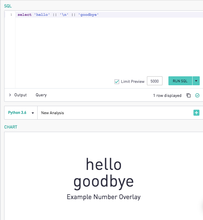
Number overlay charts can also be used to display string values returned from a SQL statement. The selected text from the query acts as the larger font, while the chart title acts as the smaller font for the label. An example can be seen below.
New lines can be added into the text in accordance with database standards as shown below.
Redshift:
select 'hello' || '\n' || 'good bye'
Postgres:
select 'hello' || '(enter)' || 'good bye'
MySQL/SQL Server:
select concat('hello', '\n', 'goodbye')
Note: For non-dynamic text charts that do not depend on SQL, reference Text on Dashboard documentation here.
<a name="ConditionalFormatting"></a>
Conditional Formatting
Conditional formatting can be used to change the background and text color of the chart when the displayed number matches the specifications. To use conditional formatting, first select the column of the displayed value, the same column selected as the y axis. Then, choose one of the conditions and pick an appropriate threshold value. Only static threshold values are supported, and only for the y-axis/displayed value column.
<a href="#top">Back to top</a>
<a name="AreaCharts"></a>
Area Charts
The area chart fills in the distance between the x-axis and a line, and the distance between one line and another, with color.
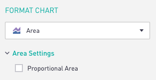
<a name="ProportionalArea"></a>
Proportional Area
The area chart plots the x-axis and y-axis of the values in the underlying table. The Chart Format tab has a "Proportional Area" checkbox that scales the values of each x-axis point to be out of 100% when checked.
<a href="#top">Back to top</a>
<a name="ScatterCharts"></a>
Scatter Charts
Scatter charts are similar to line charts in that they only require two columns: an x-axis and a y-axis. A third column can be added to generate separate segments or groupings of a points on the same x-axis. The only difference between a scatter chart and a line chart is that scatter charts will plot each point individually without connecting them.
<a name="ShowTrendline"></a>
Show Trendline
Scatter charts provide the option to show the linear regression trendline of the data.
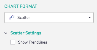
For scatter charts with segmented data, a trendline is displayed for each segment.
<a href="#top">Back to top</a>
<a name="BarCharts"></a>
Bar Charts
Bar charts also only require an x-axis and a y-axis. A third column can be added to generate separate segments or groupings of a bar on the same x-axis. As is the case with line charts, Sisense will add y-values with the same x-value if the points do not have separate segments. The special options available for bar charts can be found in the Chart Format tab, and are shown below:
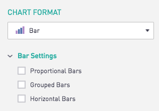
<a name="ProportionalBars"></a>
Proportional Bars
Enabling the "Proportional Bars" checkbox scales each group of bars to be out of 100%. If the segments are stacked, then this setting will touch the 100% marker.
<a name="GroupedBars"></a>
Grouped Bars
Sisense's default setting is to stack segments of bars that occur on the same x-axis point. Enabling the "Grouped Bars" option will unstack the segments, and place them side-by-side.
<a name="HorizontalBars"></a>
Horizontal Bars
The "Horizontal Bars" setting turns the bar chart at a 90 degree angle, so the bars go from left-to-right instead of bottom-to-top.
<a href="#top">Back to top</a>
<a name="BubbleCharts"></a>
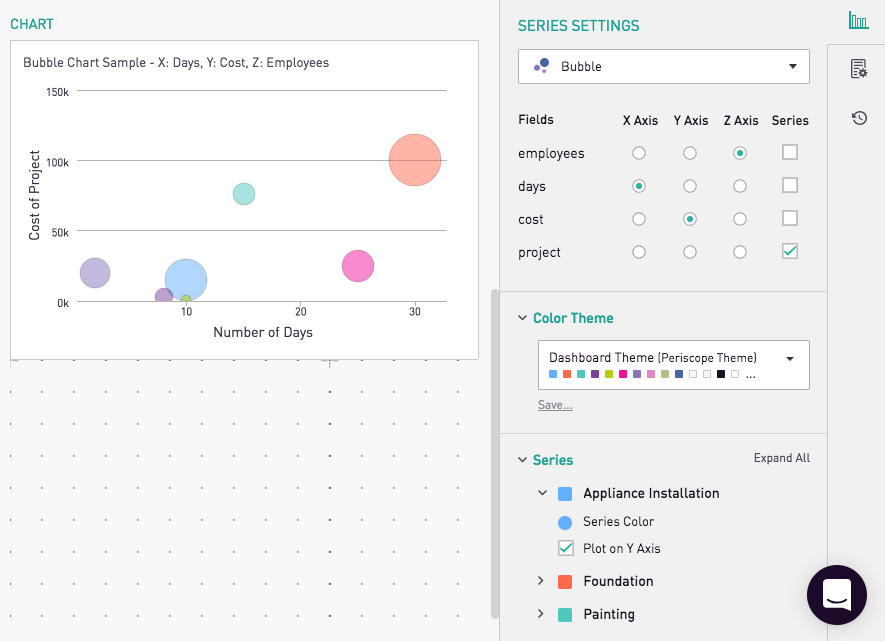
Bubble Charts
The bubble chart requires three columns, one to plot on each of the axes x, y, and z. As with the x-y chart types, the columns acting as the y-axis and z-axis must be numeric. The z-axis acts as the weight, and controls the size of the bubble being plotted on the chart.
Columns can be applied to each axis via the Series Settings tab of the editor. Segmentation and Tooltips can also be applied, so a bubble chart may look like the one below.
<a href="#top">Back to top</a>