Plot.ly
Plot.ly is a JavaScript graphing library that enables interactivity in python and R charts.
Note: Plot.ly Dash is not supported.
Leveraging Plot.ly in Python
Plot.ly can be added to the python environment by importing it like any other supported library:
import plotly.plotly as py
from plotly import graph_objs as go
To pass Plot.ly interactive plots to Sisense for Cloud Data Teams for visualization, pass the figure into periscope.plotly(). Note that this replaces the typical py.iplot command:
data = [trace]
fig = go.Figure(data = data, layout=layout)
periscope.plotly(fig)
The plot.ly Mode Bar is off by default. It can be enabled by including the config parameter into the periscope.plotly() command:
periscope.plotly(figure,config={'displayModeBar':True})
Leveraging Plot.ly in R
Plot.ly can be added to the R environment by importing it like any other supported library:
library(plotly)
To pass Plot.ly interactive plots to Sisense for Cloud Data Teams for visualization, pass the figure into periscope.plotly(). Note that this replaces the typical api_create command:
p <- plot_ly(data = iris, x = ~Sepal.Length, y = ~Petal.Length, type = 'scatter', mode = 'markers')
periscope.plotly(p)
The plot.ly Mode Bar is off by default. It can be enabled by including the config parameter while building the plot.ly figure in R as shown below:
p <- plot_ly(data = iris, x = ~Sepal.Length, y = ~Petal.Length, type = 'scatter', mode = 'markers') %>% config(displayModeBar = TRUE)
periscope.plotly(p)
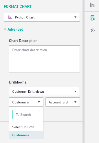
Drilldown from Plot.ly Charts
Drilldowns that are normally configurable on built-in Sisense for Cloud Data Teams chart types are also available on Plot.ly charts.
Plot.ly drilldowns allow mapping values from traces to filter values. In order for drilldowns to work, the trace must be given a name, as seen in the below example. This trace can then be used as the “column” in the drilldown dropdown menu.
trace = go.Scatter(
x = df['count'],
y = df['customer_id'],
mode = 'markers',
name = 'customers'
)
data = [trace]
periscope.plotly(dict(data=data))
Note: Plot.ly only supports drilling down on one value, one filter. Drilldowns do not work on tables or maps.
Python Plot.ly Example: Sankey Chart
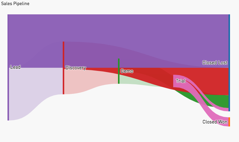
This is an example Python script which uses Plot.ly to make a Sankey chart (example shown above). This displays flow through multiple stages. SQL output should return individual elements in their stages with columns for 'unique_id', 'stage_name', and 'sort.'
# SQL output is imported as a dataframe variable called 'df'
import pandas as pd
import numpy as np
DEFAULT_PLOTLY_COLORS = [
'#1f77b4', # muted blue
'#ff7f0e', # safety orange
'#2ca02c', # cooked asparagus green
'#d62728', # brick red
'#9467bd', # muted purple
'#e377c2', # raspberry yogurt pink
'#7f7f7f', # middle gray
'#bcbd22', # curry yellow-green
'#17becf' # blue-teal
]
def color(i):
return DEFAULT_PLOTLY_COLORS[i % len(DEFAULT_PLOTLY_COLORS)]
def rgb_from_hex(hex):
h = hex.lstrip('#')
return ",".join(str((int(h[i:i+2], 16))) for i in (0, 2 ,4))
def is_circular(df_agg, row):
circular_reference = df_agg.query(f'prior_stage_index == {row["stage_index"]} & stage_index == {row["prior_stage_index"]}')
if circular_reference.size == 0:
return False
elif circular_reference['count'].iloc[0] > row['count']:
return True
else:
return False
df.columns = [c.lower() for c in df.columns]
stages = df.groupby(['stage_name']).size().reset_index()[['stage_name']]
stages['stage_index'] = stages.index
stages['color'] = stages.apply(lambda r: color(r['stage_index']), axis=1)
# print(stages)
df['stage_index'] = df.apply(lambda r: stages.loc[stages['stage_name'] == r['stage_name']]['stage_index'].iloc[0], axis=1)
df['prior_stage_index'] = df.groupby('unique_id').stage_index.shift()
df = df[np.isfinite(df['prior_stage_index'])]
df['prior_stage_name'] = df.apply(lambda r: stages.loc[stages['stage_index'] == r['prior_stage_index']]['stage_name'].iloc[0], axis=1)
df['prior_stage_index'] = df['prior_stage_index'].astype(int)
df_agg = df.groupby(['prior_stage_index', 'prior_stage_name', 'stage_index', 'stage_name']).size().reset_index(name='count')
df_agg['is_circular'] = df_agg.apply(lambda row: is_circular(df_agg, row), axis=1)
df_agg = df_agg.query('is_circular == False')
priors = df_agg['prior_stage_index']
ends = stages.query('stage_index not in @priors')
print(ends)
df_agg['color'] = df_agg.apply(lambda r: f'rgba({rgb_from_hex(color(r["prior_stage_index"]))},{.95 if r["stage_index"] in ends["stage_index"] else .25})', axis=1)
print(df_agg)
data=dict(
type='sankey',
node=dict(
label=stages['stage_name'],
pad = 20,
thickness = 5,
color=stages['color'],
line=dict(
width=0
)
),
link=dict(
source=df_agg['prior_stage_index'].astype(int)
,target=df_agg['stage_index']
,value=df_agg['count']
,color=df_agg['color']
)
)
layout = dict(
font = dict(
size = 16
),
hoverlabel = dict(
bgcolor = 'purple'
),
margin=dict(
t=20,
b=50,
l=10,
r=10
)
)
fig = dict(data=[data], layout=layout)
periscope.plotly(fig)
Looking for More?
For full documentation on R and Python Integration, click here.