Data Discovery
👤 This documentation is intended for Discovery Users. SQL Users looking for steps on how to create a dataset can refer to the Creating Datasets documentation page. Site Administrators looking to create a Discovery access group can refer to the Managing User Permissions documentation.
Data Discovery enables Discovery Users to create visualizations on datasets through a drag-and-drop interface that does not require SQL.
Note: Data Discovery is available on select plans. Site administrators can contact their Customer Success Manager for additional information.
Create an Exploration
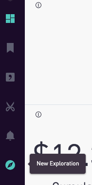
To start using Data Discovery, users with Discovery permissions can click the “New Exploration” icon on the left hand navigation bar, as shown below. This will open the Discovery interface.
Alternatively, Discovery Users can click on the "Add chart" button to open the Discovery interface on an existing dashboard they have access to.

Select or Upload a Dataset
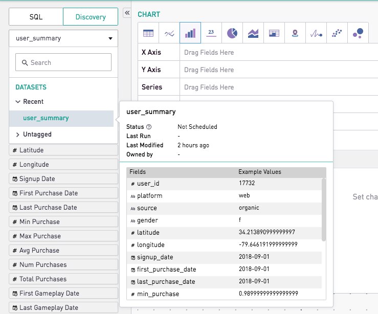
The Data Discovery feature requires users to first select an existing or upload a new dataset to explore.
To select an existing dataset, users can reference the available datasets in the menu dropdown on the left side of the screen. The dataset description will also appear upon hovering over the dataset name.
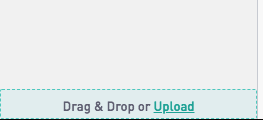
Discovery users also have the option to upload a CSV to use as a dataset using the prompt at the bottom left corner of the screen. See here for CSV file requirements.
Once a dataset has been selected or uploaded, users can select from available data fields on the left-hand side to create their visualizations.
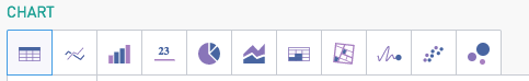
Chart Type
The toolbar at the top of the editor lists the different chart types that Discovery Users are able to create. The current chart types supported are Tables, Line Charts, Bar Charts, Number Overlays, Pie Charts, Area Charts, Cohort Grids, Maps, Sparklines, Scatter Plots, and Bubble Charts.
Data Fields
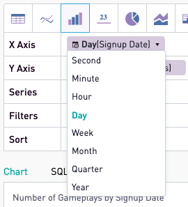
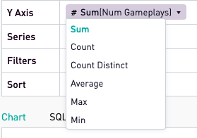
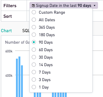
Fields from the dataset appear on the left-hand side of the editor and can be dragged into their respective fields. When relevant, drop down arrows expose additional options to aggregate dates, perform calculations, and set date ranges.
Once the appropriate fields have been selected, visualizations can be further tailored in the Format Chart menu on the right-hand side of the editor.
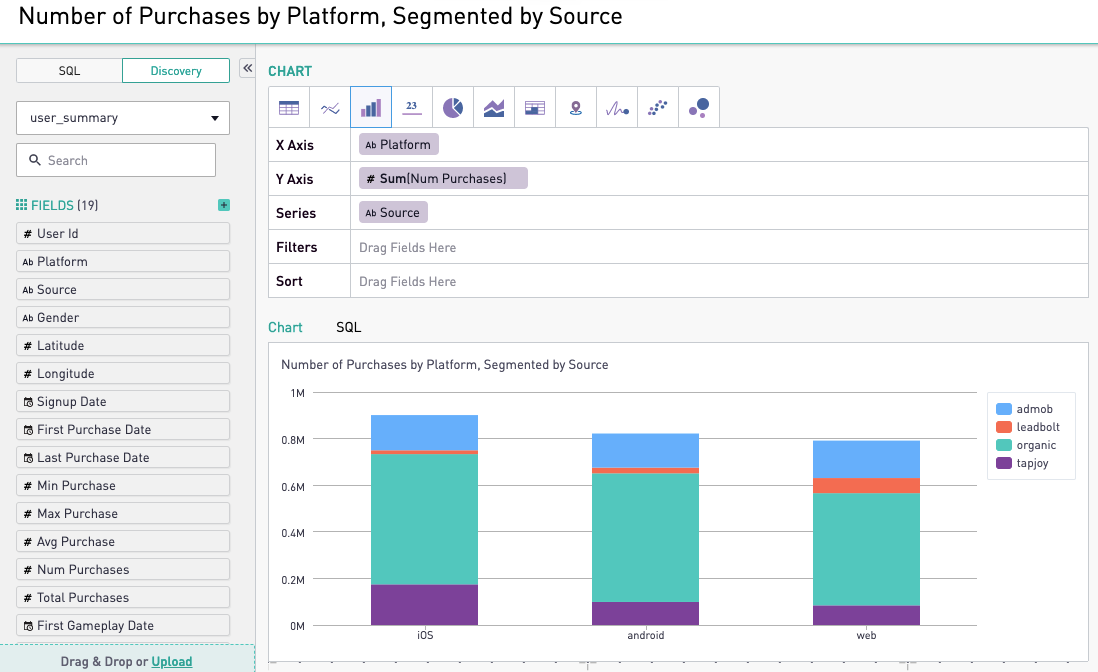
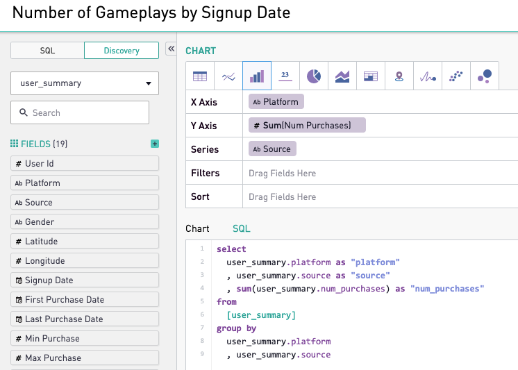
Building Graph-like Charts
Graph-like charts include line charts, bar charts, area charts, sparklines, bubble charts, and scatter plots.
The X and Y axis fields determine which values correspond to each axis. The Series field determines how the data is segmented, automatically assigning a different color to each series. The Filters field designates any filtering criteria to apply on the final visualization. Sort fields determine how the data is ordered in an ascending or descending manner, and allow users to enter any limits to display only a specified number of values. By default, charts created through Data Discovery show up to 20000 rows. This limit can be adjusted in the Sort field, provided the final dataset is under 4.7 MB.
Note: Filter requirements are additive - a data point must satisfy all filtering criteria in order to be displayed in the final graph.
Building Table-like Charts
Table-like Charts include Tables and Cohort Grids. Both chart types contain fields for users to enter any desired Columns, Filters, and Sort specifications. The Columns field determines which fields will be displayed as the columns of the table. The Filters field designates any criteria that the data points must meet in order to be displayed in the final chart. Sort allows the final visualization to be arranged by a specific column's values. By default, charts created through Data Discovery show up to 20000 rows. This limit can be adjusted in the Sort field, provided the final dataset is under 4.7 MB.
In addition to the above, Cohort grids allow users to designate Rows, Values, and Details. Rows designate the field(s) along the vertical axis of the chart. Values determines the summary metric being displayed in each pivot cell. Fields dragged in "Details" will be added as columns with additional information on the left-hand side of the cohort grid.
Learn SQL
Once a Data Discovery chart has been made by dragging and dropping the values into the appropriate sections, users can switch to the SQL tab next to the Chart preview tab. Here, users can see the SQL generated for their chart, and see how it changes with additional dragging and dropping of fields.
Looking for More?
For examples of building charts and using the various options in the Data Discovery interface, visit our documentation page here.
For answers to frequently asked questions, visit our Data Discovery FAQ page here.