Graph-like Charts Overview
👤 This documentation is intended for SQL User.
Graph-like Chart is the family of charts that require using at least two columns to plot in relation to each other. Within Sisense, the following types of charts can by plotted onto X-Y axes:
- Line
- Sparkline
- Number Overlay
- Area
- Scatter
- Bar
- Bubble (requires Z Axis)
In This Article:
- Deciding What to Plot -- Series Settings Tab
- X Axis Settings
- Y Axis Settings
- Chart Customizations -- Chart Format Tab
- Calculate Cumulative
- Show Data Labels
- Title-Case Series Names
- Animate on Dashboard
- Fill in Null Values
- Enable Aggregation into "Other" Series
- Legend Settings
- Additional Series Settings Tab Customizations
Deciding What to Plot -- Series Settings Tab
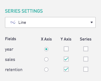
The Series Settings tab is the go-to place for choosing which columns will be plotted on the X and Y axis:
Plotting on Y2
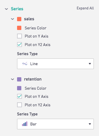
When plotting two Y values of different scales on the same X Axis, a second Y Axis (Y2) can be used to display the data clearly on two seperate scales but still in the same chart. Using the Series Settings tab, select the Y2 Axis box for the column that should be plotted on the Y2 Axis.
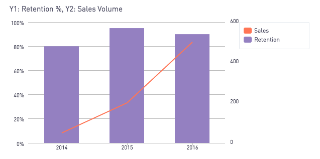
The chart will then take on a second Y Axis, Y1 on the left and Y2 on the right.
Plotting on Z
Only bubble charts support the tertiary Z axis. To find out more about bubble charts, see Chart Types.
Segmentation
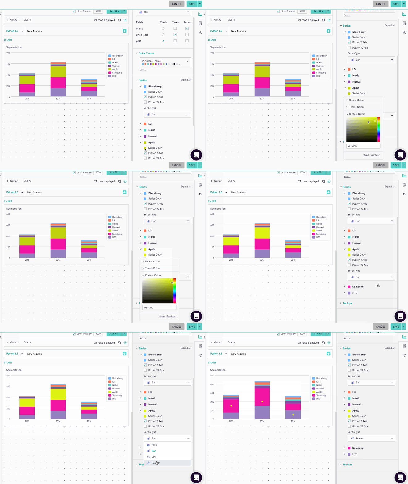
Y Axis values can be segmented out by a third column in a query. This results in more series being created, and each series's color and type can be controlled in the Series Settings tab.
X Axis Settings
X Axis settings can be found in the Format Chart section.

Show All X Axis Labels
Charts will automatically reduce the number of labels displayed if the axis is not continuous. This option displays all axis values if checked.
Rotate X Axis Labels
For X Axis labels that are to too long to display horizontally without overlapping, turn on this option to rotate the labels.
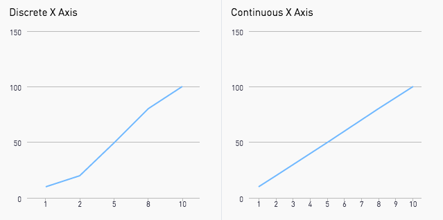
Make Axis Continuous
The X Axis can be interpreted as discrete or continuous and controlled through this option. By default Sisense will chart all X Axes as continuous.
Y Axis Settings
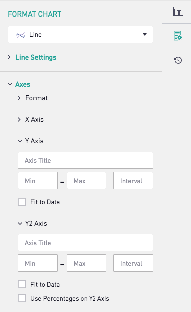
Y Axis and Y2 Axis settings can be found in the Format Chart section.
Formatting Y and Y2 Axes
The format of a Y Axis is controlled in the Axes Settings section of the Chart Format Tab.
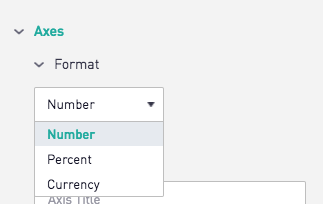
The format of the Y2 Axis can be set at the bottom of the settings tab under the Y2 Axis Settings section when a Y2 Axis has been set.

Chart Customizations -- Chart Format Tab
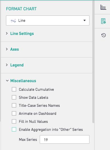
X-Y Charts share many settings from the Chart Format tab within the edit view of the chart.
Calculate Cumulative
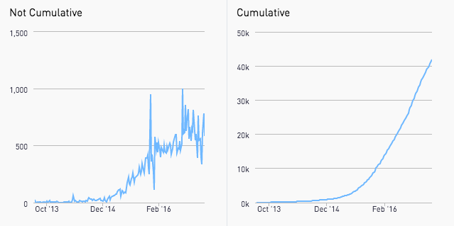
Turning on this setting will calculate the cumulative total of the Y axis up to the current X Axis point for a series and plot that. When using a Number Overlay chart, the number overlay will display the total of the cumulative value for the first series plotted.
Show Data Labels
For data points to be explicitly stated on the chart, turn on the Data Labels to have the Y-Axis value of each data point shown.
Title-Case Series Names
The checkbox “Title-Case Series” capitalizes the first letter of each word in the series and remove underscores.

Animate on Dashboard
This option allows charts to be animated. Once checked, graph-like charts will draw each data point individually.
Fill in Null Values
If a result set does not consistently fill a continuous X axis, use the the Fill in Null Values option to chart the gaps. Fill With Zeroes will plot all points on the X Axis that don't have data with a 0. Fill From Left will take result in any X Axis value that does not have data using the value to the closest point left of it.

Enable Aggregation into "Other" Series
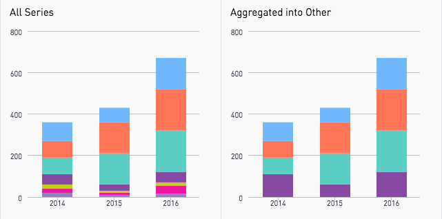
If a chart has a lot of series with most being very small and hard to visualize, turn on Aggregation into “Other” Series to combine those smaller series into a single series called “Other”.
Legend Settings
Legend Position
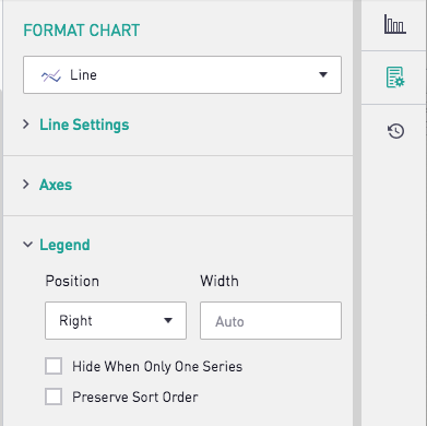
This dropdown allows users to specify where the legend should appear on the chart. Users can choose from Right, Left, Top or Bottom, or can hide the legend using the None option. Legends placed on the right and left also provide an option to specify width in pixels. If no width is specified, the legend will be auto-sized to the length of the longest series name.
Hide When Only One Series
When the drop down is set to any option other than 'None', this option will hide the legend box if only one Series segment is returned.
Preserve Sort Order
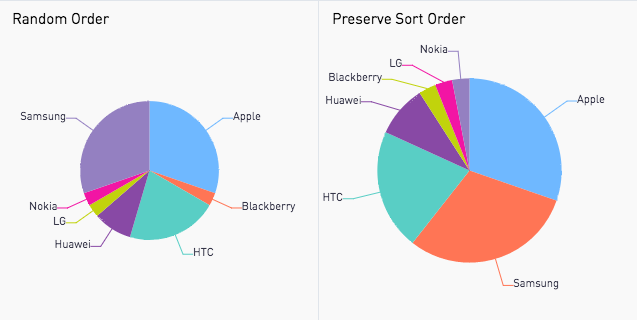
To maintain the order imposed by the ORDER BY clause in the query on the charts, turn on Preserve Sort Order.
Additional Series Settings Tab Customizations
Tooltips
Showing additional data from a result set without cluttering a chart can be achieved through adding tooltips. In the series tab, select which column's data should appear in the tooltip when that row is hovered over. Turning on the Total in Tooltip will show a sum of the Y axis values across all series for a single point on the X axis upon hover.

For additional documentation on chart options click here.
 is now Sisense for Cloud Data Teams


